
With around 13 million subscribers, Instant Ink is a thriving and extremely large business. While the majority of subscribers find the value of Instant Ink, some people just have reasons to not maintain their subscription. In order to do what’s best for the customer, as well as to meet legal requirements worldwide, I volunteered to spearhead this monumental project.
While what we had in production was technically meeting legal definitions, I knew we could do better, so (with the blessing of business and leadership) I moved forward with a plan to reinvent the cancellation flow. My main goal was to ensure that customers had all the information they needed when cancelling, as well as informing them of what that means for their printing needs after their subscription ended.
Scope
- User Experience
- User Interface
- Product Design
- Wireframing
- Prototyping
- QA
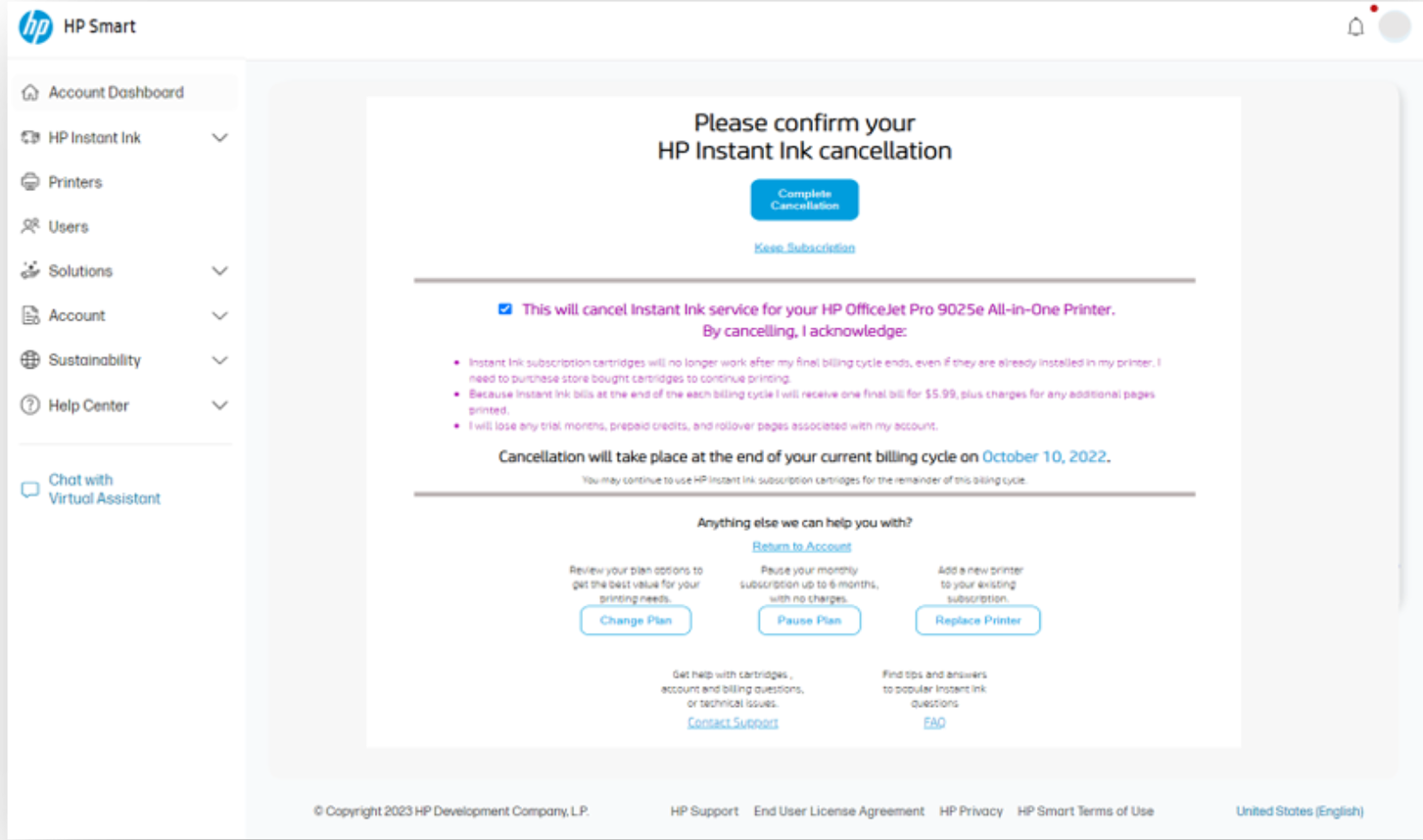
Before State
Legally compliant? Yes. An ideal user experience? Not as much.
Inception
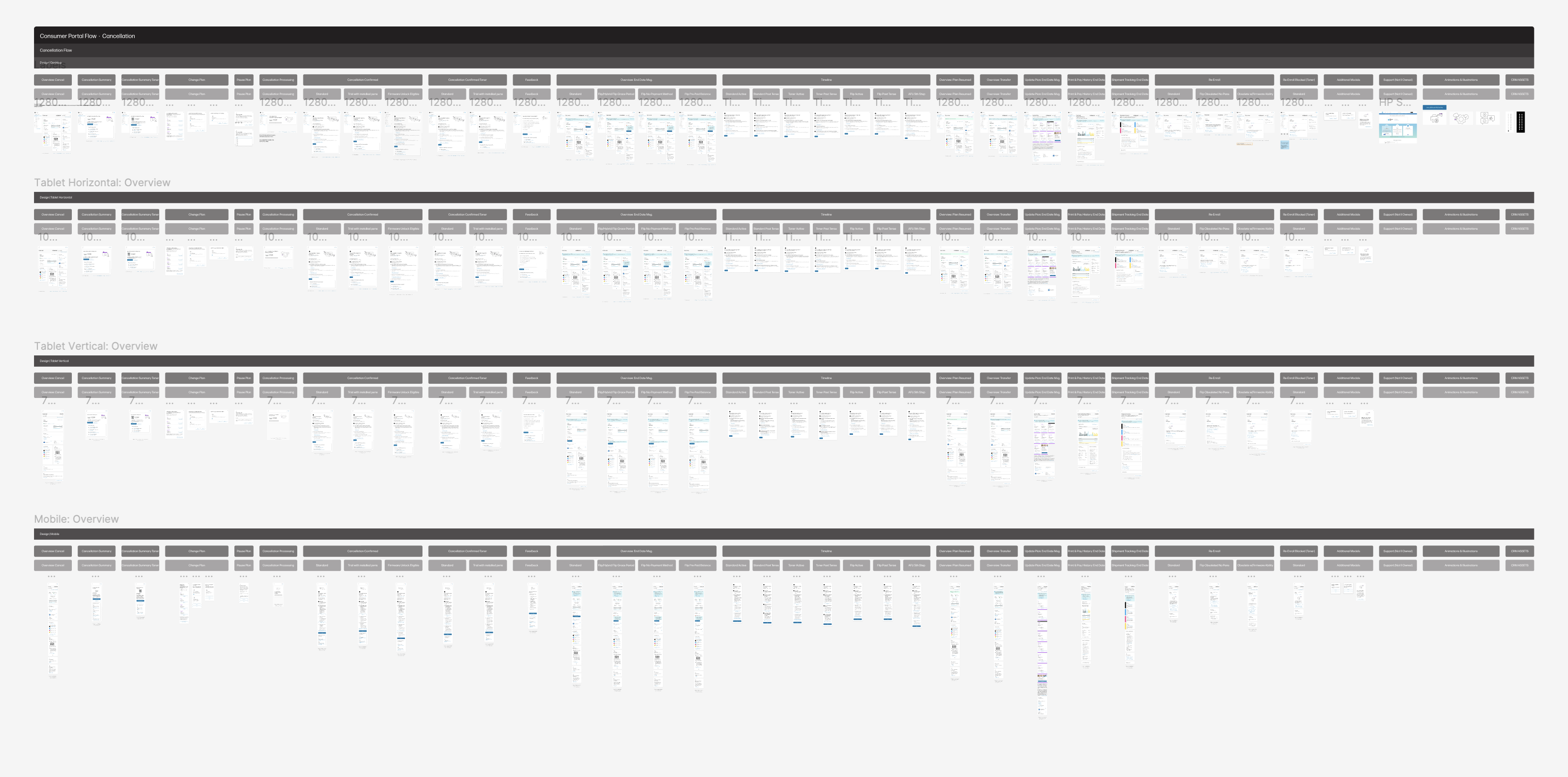
We started by compiling internal and external research from customers who had left Instant Ink, as well as by wireframing up new ideas. After meeting with stakeholders, I took an approach based on a recent trend of presenting timelines when enrolling in a service. I had not seen this implemented in an off-boarding flow, so I started mocking it up.
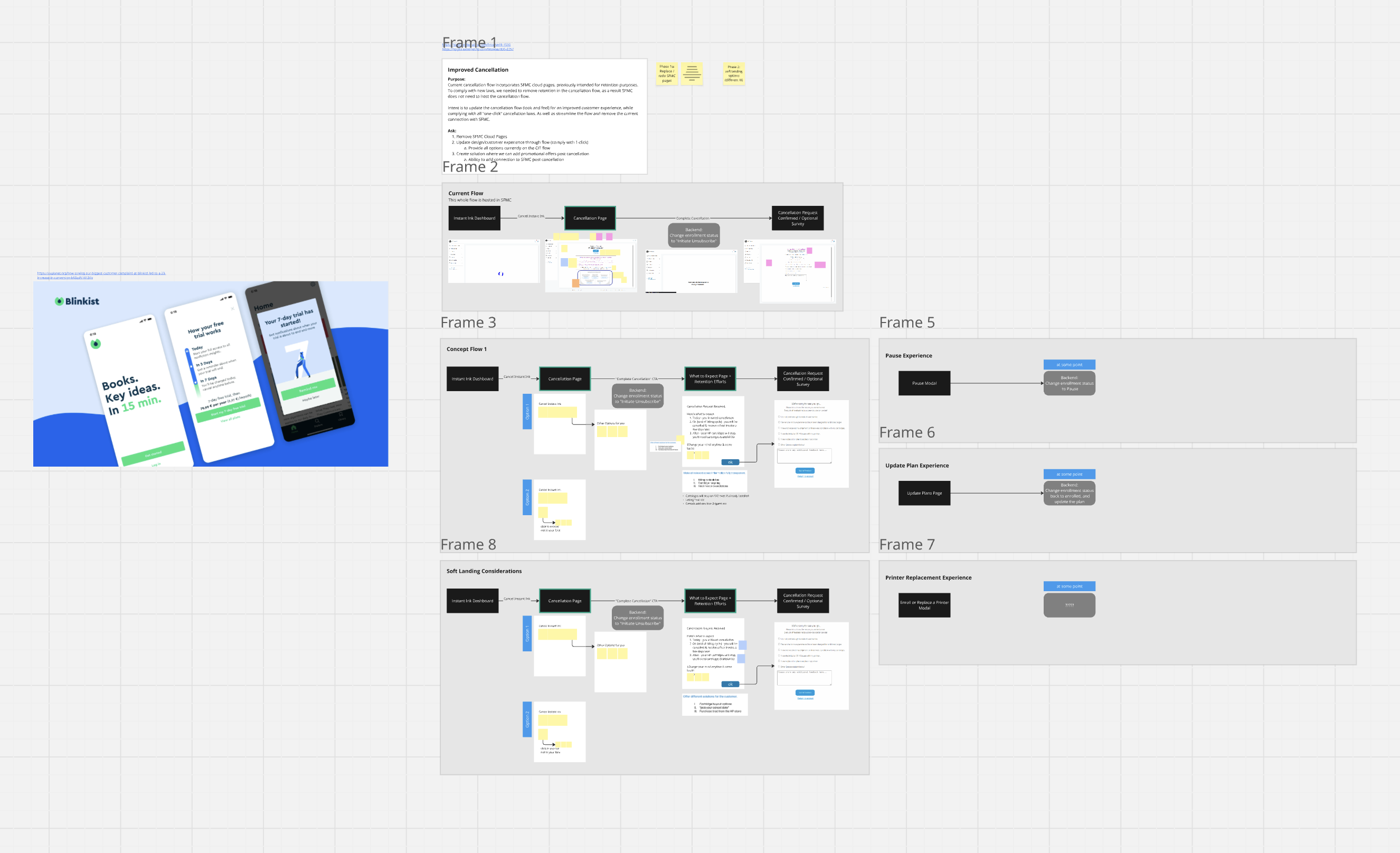
Wireframe, IX Design, and business reviews
We presented this high level to the business team. They liked it – a lot. So we fast tracked work on this, setting up a project team to manage the project with regular checkins, put it on our development roadmap, and got to work designing and creating user flows to check to make sure everything was a top tier user experience.
Research
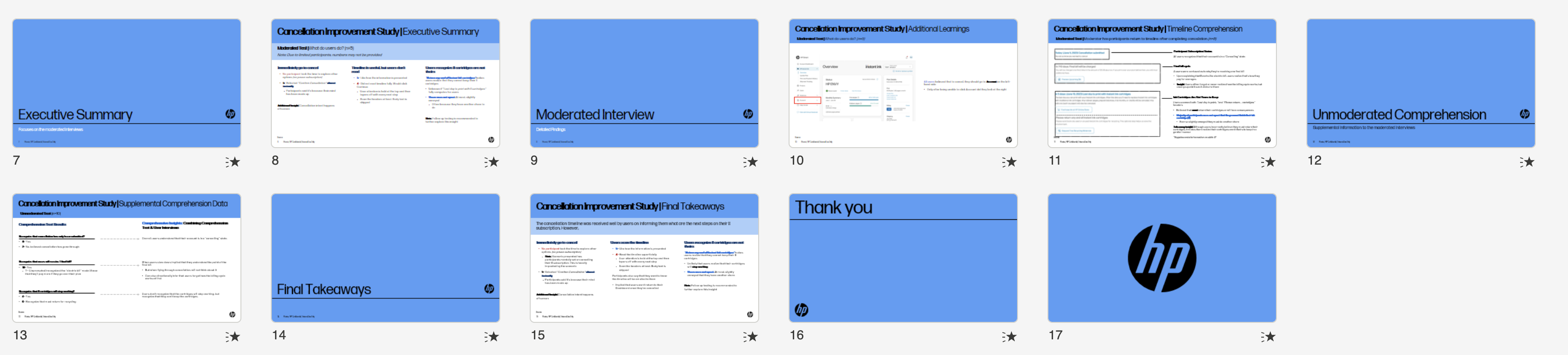
With the interaction design completed and looking pretty good, I put together prototypes of the designs to test with users. In collaboration with our internal research team, we conducted moderated and unmoderated testing of designs. The results were a success, users understood what was going on with their cancellation, we were increasing comprehension of what users would expect to happen after cancellation. Some customers even said cancellation was easier than they expected, with comments like “wow, that was easy.”
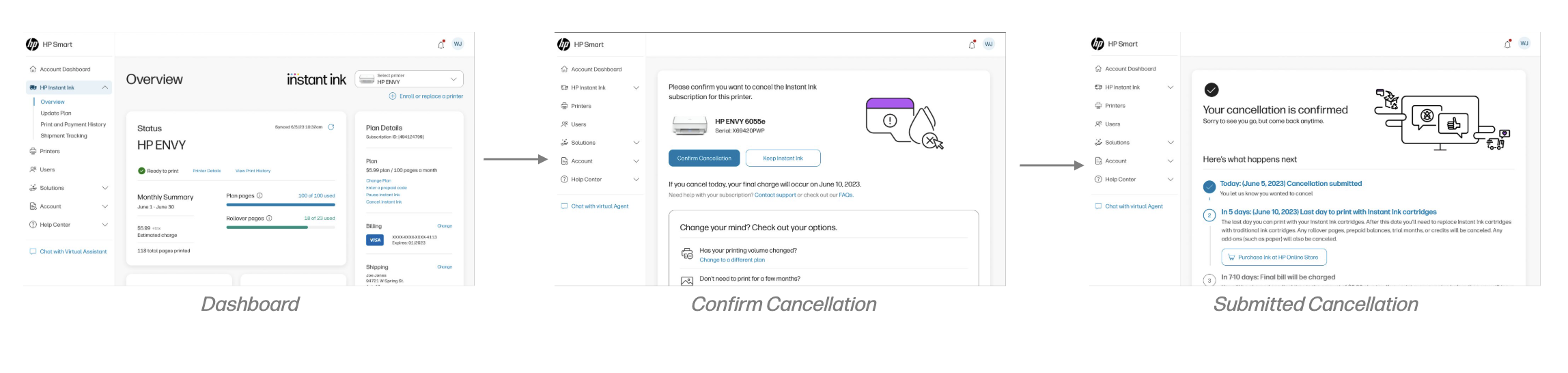
Visual Design & Preparing for Development
With a few minor tweaks and positive sentiment, I collaborated with my Visual Designer (Sarah Snow) to prepare for development, perfect the pixels, make sure all screen sizes were represented, and make it look even better. We also prepared a lot of artboards of various use cases as was the internal process at that time.
Final Designs
The initial launch phase of the project was finished. It immediately had both a business and customer service impact.


Results
While the metrics are not allowed to be publicly disclosed at this time, we were able to reduce customer support call volumes, increase customer retention at a rate of double digits, and, best of all, we were able to instill confidence in the user that they would be in control of their subscription status.
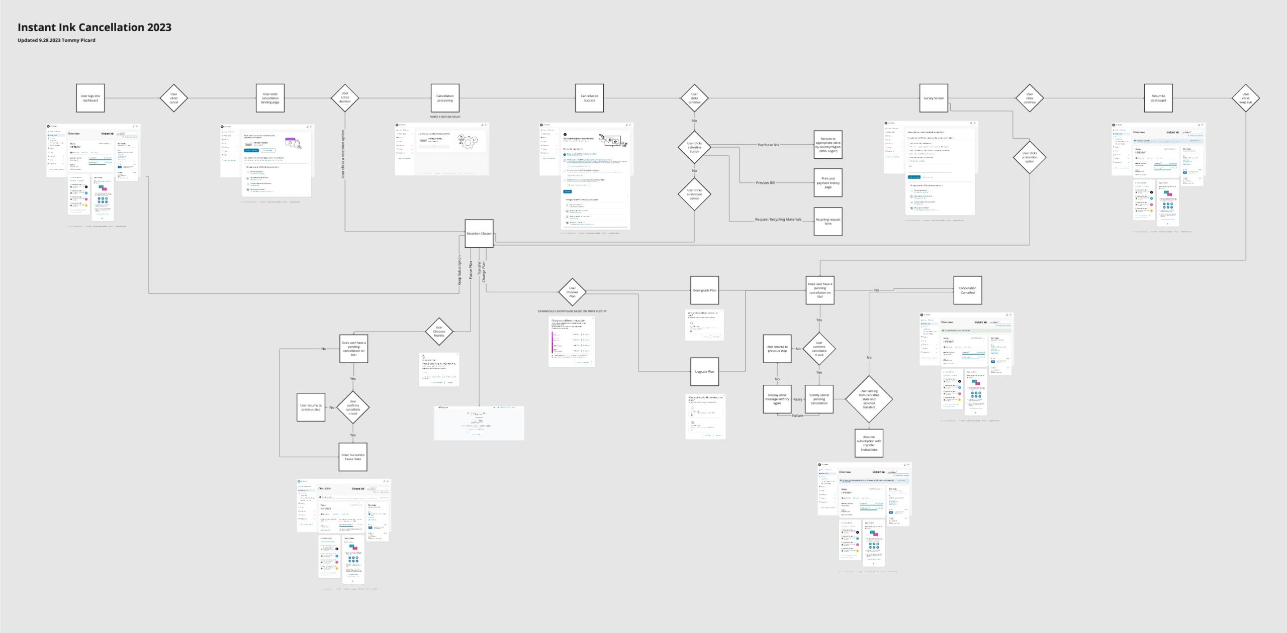
Next Phase
We continue to perform A/B testing, upsell improvements, and other retention strategies to improve the experience for the consumer. More to come!